This is the 3rd part in a series on designing Data Studio dashboards. I suggest starting with part 1 and working your way through the series so you understand all the references in this article.
If you’ve read through part 1 and part 2 then you should have a sense of the ideas you’re trying to communicate with your dashboard, the sections for your page, and the metrics that you’ll be fitting into each section.
But before we start filling in all that content we need to decide on our style.
I’ll be breaking this into three main sections:
- The basic mechanics – the design features available in Data Studio
- Finding inspiration – the best way to get started if you have zero design skills
- C’est Style – tips for getting a little more fancy
The basic mechanics
We’re going to be thinking about three ‘levels’ of design on our pages.
Understanding Data Studio theme options
When you open your dashboard in Data Studio you’re immediately presented with Theme options. There are built in themes that are perfectly fine to use, but you also have the option to build a custom theme.
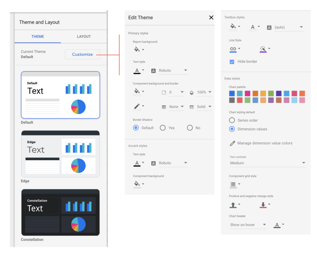
Think of these settings like the defaults for your page and the defaults for the elements on the page.
You can always change these later but this is the time to start thinking about your color scheme, font choices, accent styles, etc.
Now I can’t tell you the right options for your unique situation but I’ll give you my general guidance step by step:
- Report background: Instead of choosing black or white, I always suggest choosing either a very light grey or a very dark blue/green. I’ll go into more details about this in the upcoming color palette video.
- Text style: I suggest trying something other than Roboto or the other defaults but not something super stylized like Comic Sans. I love Montserrat but test out a few and see what you like.
- Component background and border: I keep the background and outline transparent and the opacity at 100%. You will most likely want to change the styles on each element individually but most of the time if you want a background/border you will just create it using a background shape (more details on this process are coming in Part 5)
- Border Shadow: I would leave this on default and decide as you go. You can’t fine tune your border shadows in Data Studio so it’s typically best to not plan on using them without testing them first.
- Accent styles: I suggest changing the font to match your overall text style but leave the other settings at default and change them later if you find that you need to.
- Textbox styles: leave these as default and change them later if necessary.
- Link style: leave as default unless you specifically have link color requirements.
- Chart palette: This element is incredibly important but requires its own article to explore in more depth (link here). If you leave these as the default setting you’ll find that your Data Studio report looks kind of similar to every other other Data Studio report, especially if you combine it with other default style settings.
- Series order vs Dimension values: this is asking if you want to have the elements in your charts colored based on the order they’re listed or if you want to assign a specific value to each dimension (in other words do you want Facebook data in your chart to always be blue? Or do you want each chart to just use the same color in the same order whether it is Facebook data or another social network?)
- Text contrast: I suggest choosing high because it improves accessibility for those with visual impairment.
- Component grid style: I like my grids to be a lighter color than default but this is purely personal preference
- Positive and negative change style: if you choose to have a comparison on your scorecards showing how much a value has changed the up and down arrows will use these color selections. You may want to change these if you have a background that is green or red because the arrows might blend into the background color.
- Chart header: leave as default unless you notice that the chart headers are confusing your users
Understanding your layout settings:
Layout is a bit more straightforward and shouldn’t take long for you to fill out. There’s a bit of thinking to be done about navigation and page size but it won’t take long.
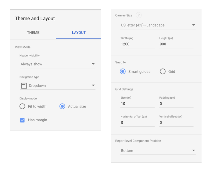
- Header visibility: Do you always want a header to show up on your page or would you prefer it shows on hover and autohides after having the page open? You need to try these out yourself to understand what they mean but I find that most users will not even realize a header is available if you use “Initially hidden” and that “Auto hide” can be a bit confusing because users might not know how to get the header back. The header includes information like a page title, sharing and data refresh options.
- Navigation type: if you are not going to build navigation into your page, you may want to add the default nav bar into the side or top of your page. If you don’t want any nav to show up, then your best bet is to select “Initially hidden” for header visibility and “Dropdown” for the navigation type.
- Display mode: do you want the page to scale up on a bigger screen? Data Studio dashboards are not responsive so this just mean the dashboard will get zoomed in to fit your screen size or will stay its original width. If you’re displaying your dashboard on a large screen/projector/tv than I would test both options first and see which you prefer.
- Canvas size: this is the size of your dashboard and will apply to all pages. If you aren’t familiar with screen sizes and aspect ratios then just leave this on the default setting or choose another common size from the dropdown menu. If you’re building a dashboard for mobile devices you may want to have a narrow screen that is super long so that people can scroll. This can work and I’ve seen it done before.
- Snap to and Grid Settings: I prefer smart guides because it helps me align different charts/elements on the page. Some people prefer snapping to a grid. This is just a preference. You can test both and then adjust your grid settings in the section below.
- Report-level Component Position: if you create report-level components like a nav or a custom header do you want them to sit beneath all other layers or above all other layers?
That’s it! You’re done. You’ve got your page styles established and you’re ready to go.
On-page elements:
One last important concept to keep in mind is that you are not stuck using your default theme and layout settings on every page.
You can not change each individual page size, header settings or grid settings.
But you can change your background (by adding a large rectangle to the back and changing the color), you can change the font for each element and colors/styles for each chart. So don’t feel too much pressure to get your theme settings perfect, they don’t need to work for every single part of your dashboard.
Finding inspiration
If you have no idea how to select your themes and layout settings, I highly suggest you borrow from the massive library of free templates available on the Data Studio template gallery.
This is not just a great way to save yourself some time but it’s also an extremely effective way to learn what makes a page look good.
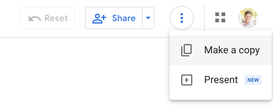
Start by finding a few templates you like and look for the ‘copy’ icon in the upper right hand corner. If copying is not enabled you won’t see the ‘copy’ icon and you’ll need to find another template.
Once you have a copy of the report you can look at its theme and layout settings.
You can also look at individual charts/shapes/elements and copy them as well.
After doing this a few times you’ll start to understand the settings and how they affect the overall look and feel of a report. Obviously you need to be ethical and use good judgement. Don’t make a carbon copy of someone’s template and claim it’s your own work. But it’s okay to take inspiration and use these free templates to better understand how to design your own reports.
C’est Style
Here are a few of my tips for adding some extra fancy style elements to a dashboard.
Use gradients!
That’s right, I said “gradients”. The color selector for backgrounds/shapes allows you to create fun and interesting gradient colors. These can be a fun way to create a really unique look and feel for your page. If you’re struggling to get these to look right, then find an existing design you like that uses a gradient and find the start and end colors using the color picker tool built into your laptop (if you’re on mac it comes with an app called “color picker” that lets you do this). It will take a bit of practice but can be a powerful tool once you get a hang of it.
Use opacity!
All charts, scorecards and shape elements have an ‘opacity’ setting. This makes an element more or less transparent. Try adjusting opacity for different parts of the page and you might find that it makes things look more cohesive.
Combine two styles on the same page
Because you can customize each shape/chart/scorecards styles, you can create a dark them and light theme on the same page. This can be a great way to break up the page and make it feel more interesting. It can also be used to guide the user and help communicate that you have two different categories of metrics on the page.
That’s it for today! In part 4 (released next week) we’ll be exploring my favorite topic: color palettes!
You can follow my Medium account to get notified when it’s released or connect with me on Twitter where I’ll post these and can answer questions.
Series links:
- Part 1: Hierarchy of data and leveraging narrative [published Apr 28, 2021]
- Part 2: Structuring and organizing your page [published May 6, 2021]
- Part 3: Choosing your page style [published May 7, 2021]
- Part 4: Sticking to a color palette [published May 13, 2021]
- Part 5: Understanding shapes and shape styles [publishing May 17, 2021]
- Part 6: Using PNGs and SVGs to do anything that can’t be done with shapes [coming soon]
- Part 7: Adding bells and whistles — remembering that complexity is a trade-off [coming soon]
Thanks for tuning in!
I hope this is valuable for you all. The Data Studio community is one of the most helpful and supportive groups you’ll find, so get engaged, ask questions, start conversations. We’re all here to help.
Josh Cottrell
DataStudioPro.com
Supermetrics Super Fan