This is the 5th part in a series on designing Data Studio dashboards. I suggest starting with part 1 and working your way through the series so you understand all the references in this article.
Google Data Studio has three core shape elements:
- ▯ rectangles ▯
- ◯ circles ◯
- — lines —
That might not seem like a lot to work with. I mean how much could you really build using only three shapes? It turns out, you can build quite a lot.
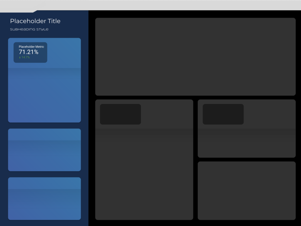
I’m going to break down how I use those three elements to go from a blank page, to the entire foundation of my dashboard. For example something like this:
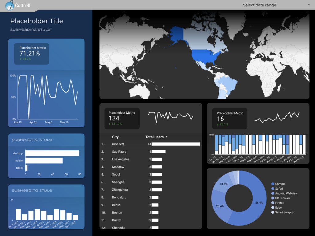
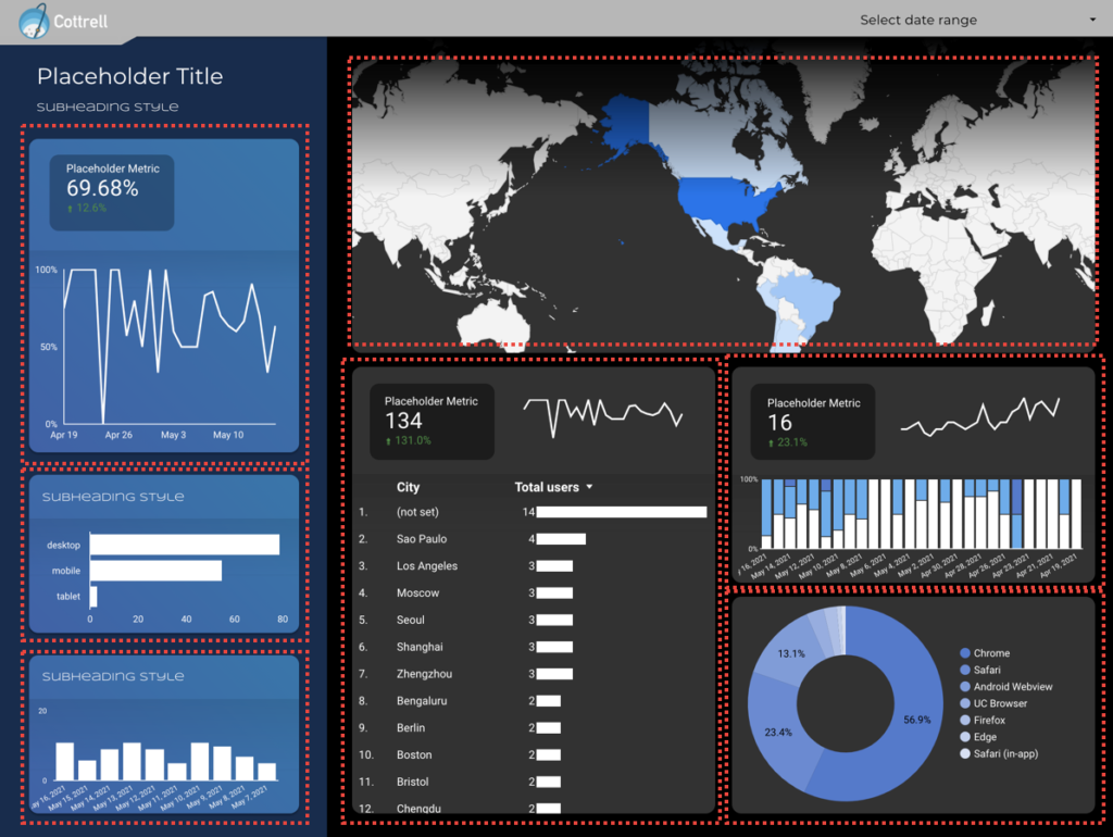
This foundation, with a few charts and a logo turns into something like this:
I’ll walk you through the process, starting with basic orientation and ending with some of the more complex tricks for making interesting visuals.
Feel free to jump to the section that best fits your needs:
- Getting oriented
- Understanding shape properties (like color, outlines and opacity)
- Layers and masking
- Alignment Tools
- Tips and tricks
Getting oriented
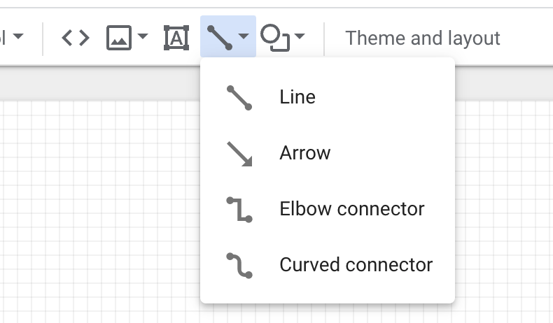
Your shape options are all available from the header bar. Lines and shapes are under two different sections:
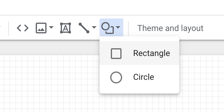
Once you select a shape, you can click and drag to put it on your dashboard and determine the size.
Once you’ve added the shape to the page you’ll see all the shape properties.
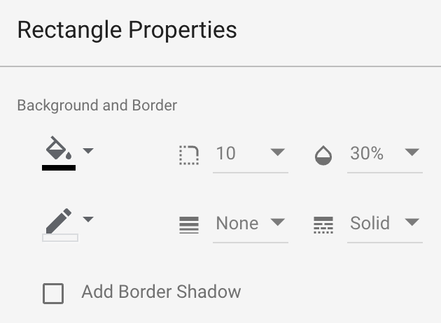
Data Studio shape properties for rectangles and circles
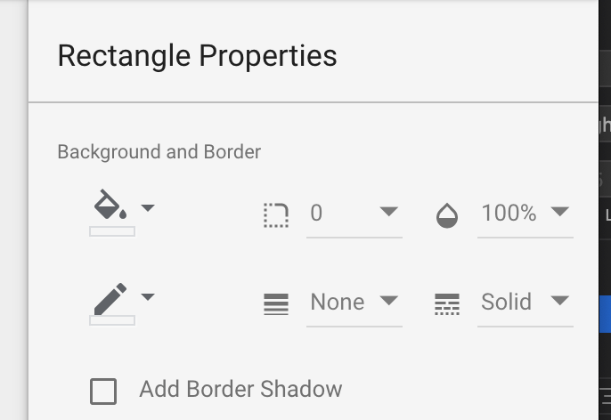
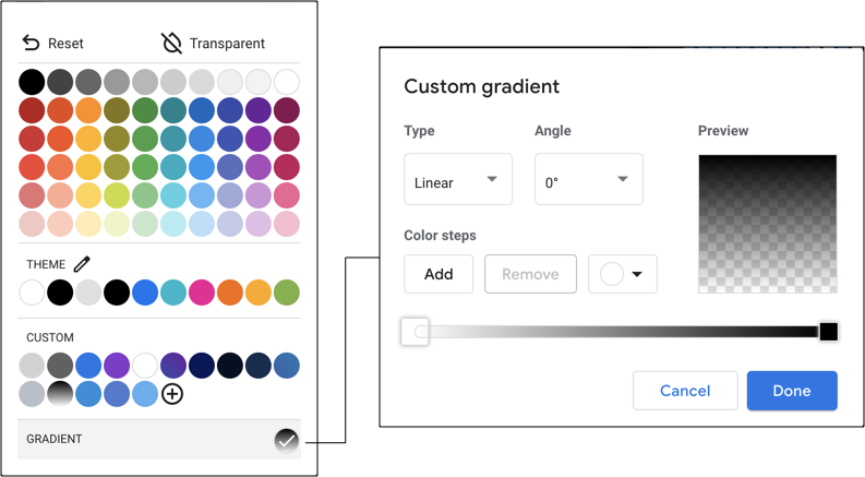
- Background color: opening this will show you your color selection options. There are three options: a normal color fill using any hex value, a transparent background and a gradient background. I’ll get into the details for selecting colors in the tips and tricks sections.
- Border color: the color of the border around your shape. I typically leave this as transparent.
- Edge rounding: for rectangles only. This is the pixel value for how round you want your corners.
- Opacity: how transparent you want your shape to be, measured using a percentage. For example 90% means 10% transparent and 90% opaque.
- Border size: the thickness of your border measured in pixel width
- Border line style: choose whether you want a solid, dotted, or dashed border.
- Add Border Shadow: this adds a small shadow along the edge of your rectangle or circle
Our only other shape option is a line. Lines have their own settings and behave a little bit differently because they include “connector” options. These connectors allow you to create a non-linear link between two points on a page which I’ll illustrate with a few examples.
Properties of lines in Data Studio
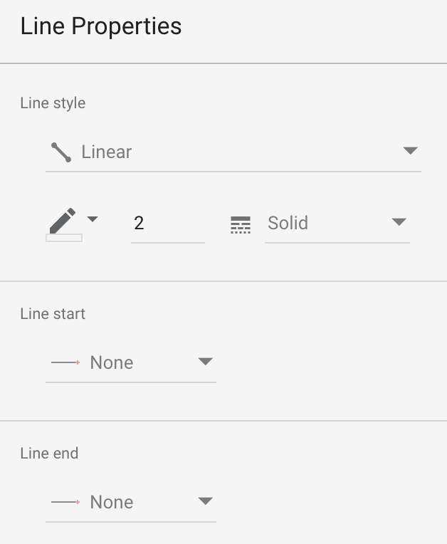
- Line type – linear, elbow or curved elbow – do you want a straight line or a squared out L-shape connector? Elbow connectors can be useful if you’re trying to keep your page organized or have a large number of lines conncting points on your page.
- Color – select the color for your line. Your limited to a single solid color (no gradients)
- Width – this adjusts the width of your line, measured in pixels
- Line style – choose whether you want a solid, dotted, or dashed line
- Line start/end – allows you to put a circle, diamond or pointer at the beginning or end of your line. To turn your line to an arrow, just change the end to a pointer.
One of the features that opens up a lot of possibilities is layering shapes on top of each other. It allows you to create more complex shapes and mask over portions of your page.
Layers and Masking in Data Studio
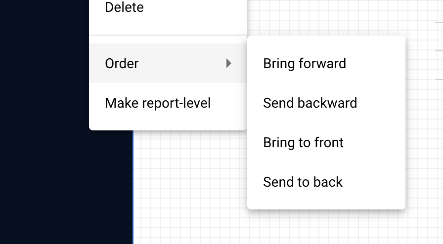
Whenever you add a new shape, layer, chart or even text in Data Studio it gets added to the top of an imaginary stack of page elements. Think of these like a stack of transparent papers with one element on each piece.

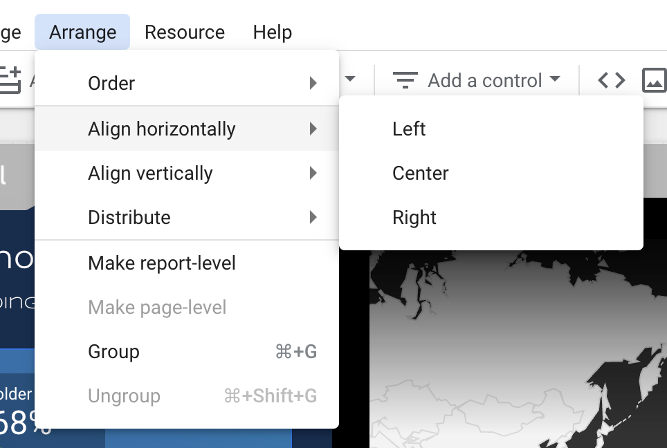
You can change where a layer fits in this imaginary stack by right clicking your shape and navigating to “Order”. Your given 4 options:
- Bright forward – brings your shape one layer forward in the stack
- Send Backward – send your shape one layer back in the stack
- Bring to front – brings your shape all the way up to the very top of the stack
- Send to back – send your shape all the way to the very back of the stack
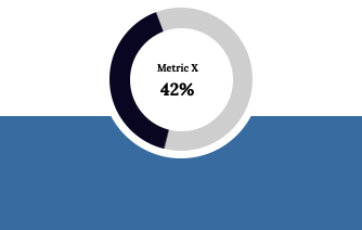
These are important because it allows you to start to do things like masking shapes or combing shapes of the same color. For example:
I can use a white circle to mask out a portion of this rectangle to add my donut chart:

Moving the circle over the rectangle give me a nice little place to put my chart.
We can even get a bit more fancy by layering several layers with different opacities and gradients together:

In this example I use three elements:
- A blue rectangle with rounded edges (the main shape color)
- A rectangle using a gradient from dark blue to transparent
- A smaller black rectangle with opacity set down to 30%

So the background is easy, just create a rectangle and select blue (or your preferred color)
The gradient is a little more fancy. You make a rectangle the same width as the background shape and then select a gradient as the background color. Like this:
Last you create another rectangle, with the same rounded edges, and make the color black but change the transparency to 30%
But one thing people struggle with is getting all your shapes lined up perfectly so your page looks cleaned and organized. Data Studio has a great set of tools for helping with this.
Aligning and grouping elements in Data Studio
Keeping your pages aligned from the start will help you tremendously throughout your project, especially later on when you need to rearrange or adjust different sections of your dashboard. An ounce of organization at the start will pay off in a pound of efficiency later on.
There are three main methods we use to align the page:
Alignment
Alignment allows you to select multiple elements (click and hold shift to multi-select) and then align them along their edges or centers. For example if you select three boxes and align them horizontally to the left then your rectangles will make all the left-most edges align.
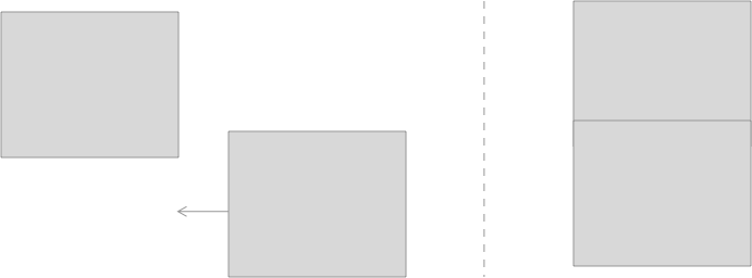
As you can probably guess the opposite is true for aligning right.
You can also align to the top, bottom or center as well.
This becomes most useful when you’re trying to align elements on a grid. Alignment lets you get everything cleaned up row by row:

Distribution
Distribution is the easiest way to get even spacing between multiple elements on the page.
When you select multiple elements you can evenly space them either horizontally or vertically:

Grouping in Data Studio
Grouping elements together is the easiest way to speed up your ability to rearrange a page.
Grouping associates a group of elements and lets you select all of them at once. It can also be used to associate multiple elements with a single filter/selector but we won’t be covering that today.
So on our example page I might group all of these elements together so I can easily click and drag them into another position on the page.
I can do this by selecting all of the elements in each of these sections and then clicking command+g or by clicking “Group” from the dropdown menu. Once they’re grouped together I can easily click and drag all the elements together without having to manually select each piece inside of each group.
Tips and Tricks
Coming soon! I’m working on boiling down a longer post to the essentials tips for this section. Should have something added in the coming week or two.
That’s it for today! In part 6 (released next week) we’ll be exploring how you can use images and SVGs to do anything that isn’t possible with regular shapes.
You can follow my Medium account to get notified when it’s released or connect with me on Twitter where I’ll post these and can answer questions.
Series links:
- Part 1: Hierarchy of data and leveraging narrative [published Apr 28, 2021]
- Part 2: Structuring and organizing your page [published May 6, 2021]
- Part 3: Choosing your page style [published May 7, 2021]
- Part 4: Sticking to a color palette [published May 13, 2021]
- Part 5: Understanding shapes and shape styles [publishing May 17, 2021]
- Part 6: Using PNGs and SVGs to do anything that can’t be done with shapes [coming soon]
- Part 7: Adding bells and whistles — remembering that complexity is a trade-off [coming soon]
Thanks for tuning in!
I hope this is valuable for you all. The Data Studio community is one of the most helpful and supportive groups you’ll find, so get engaged, ask questions, start conversations. We’re all here to help.
Josh Cottrell
DataStudioPro.com
Supermetrics Super Fan