This is the 4th part in a series on designing Data Studio dashboards. I suggest starting with part 1 and working your way through the series so you understand all the references in this article.
Over the years color has become part of my signature style on Data Studio so I’m excited to dive into it in this section. I’ve broken this down into a few key sections
- Why color is important
- Choosing your palette
- What colors to choose
- Consistency on the page
- An example of my own dashboard
Why does color matter?
Apart from being visually appealing, colors are powerful tools for categorizing data on your page. Keeping metrics, series, or categories color coded is one of the easiest ways for your audience to quickly navigate the data on your dashboard.
It’s also incredibly easy to integrate color. You just need a few basic techniques and you can get started in no time.
Choosing a color palette
What colors are you going to use? There are a few ways to approach this problem but the first thing to ask is “what will my users actually like?”
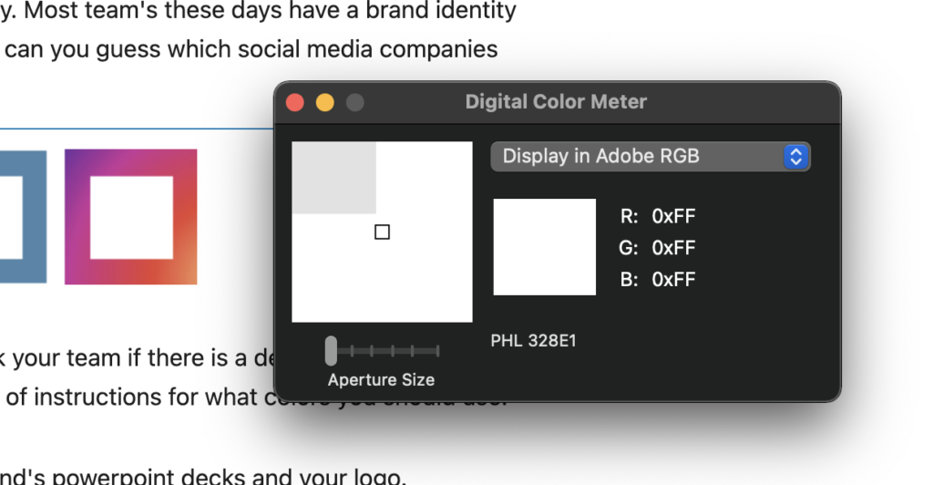
The easiest place to start is with you or your client’s brand identity. Most team’s these days have a brand identity and that brand identity typically includes colors. Case and point – can you guess which social media companies each of these colors represents?

Your brand probably has its own iconic colors. You can always ask your team if there is a design guide, brand guide or style guide available – that will usually include a clear set of instructions for what colors you should use.
If not, then you can also try to borrow colors from one of your brand’s powerpoint decks and your logo.
I will typically grab a powerpoint slide and use my computer’s built-in color picker tool to grab the color hex code. A color hex code is a six character code preceded by a hashtag like: #FF967F
These hex codes are what you’ll be using in Data Studio to select your theme, page styles, text or chart series colors. The easiest way to get the hex code for a color is to use a color picker tool. If you’re using Mac, then you should have a program called Digital Color Meter built in to your device. Open that program and when you hover over the color you like want then you can hit command+shift+C and it will copy the hex value to your clipboard and you can paste it wherever you want.
But you might be asking yourself, “there are a dozen different colors on this page, which one’s should I copy and use?”
The answer isn’t simple but I can give you some basic guidance.
Here are the colors are start with:
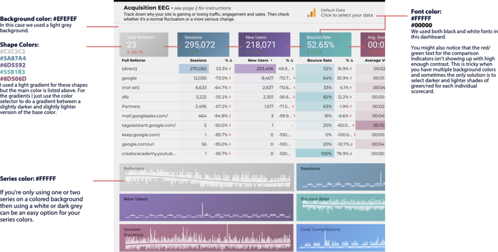
- A background color: this is typically a light grey or an extremely dark blue/green but in some cases it might be a brighter color. Consider whether you want a dark or light theme when choosing a background color and possibly choose two options in case you change your mind later.
- A ‘shape’ color: dashboards typically don’t just have metrics sitting on a blank page, instead they sit on top of a shape – like a rounded rectangle. You want to carefully choose this color because it will take up a lot of space on the page and will set the overall “feel” when combined with your background color.
- Highlight colors: what color will you use to highlight important metrics on the page? Do you need more than one color because you’ll have multiple categories of metrics to highlight? These are typically going to be a lighter, brighter or more saturated version of the other colors on the page.
- Outline colors: if you use a lot of elements that have an outline, it’s good to grab an outline color that matches the other colors on the page. People oftentimes use plain black or white but you typically need something a bit more subtle, like a slightly darker or lighter version of your shape color.
- Header/footer and nav colors: if you have a header or footer on the page, along with navigation buttons, they will probably have their own distinct colors. Grab any little details you can (including the font colors!)
- Font colors: does your brand use multiple font colors? Grab them all. These are frequently just white or black but it’s worth double checking.
- Series colors: if you have any charts using multiple series or multiple dimensions then you’re going to want a set of colors you can use for all those data. This is where a brand/style guide might fall short Most brands don’t have a giant set of colors to choose from. I’m typically looking for 10 visually distinct colors. This process requires some practice but the basic principle is that you’re striking a balance between colors that match your brand and colors that you can visually differentiate if they’re right next to each other on a line chart. So for example.
Let’s say we’re making a color palette based on a brand identity that uses red colors like Beats:

Colors that match a brand color but are NOT visually distinct:

These may all be in the same core color palette but you won’t be able to distinguish between them if they’re all on the same chart. For example can you tell which of those colors is used in this line chart? It’s almost impossible to tell which color is used for each line in the graph:

So instead we can choose colors that are a bit more distinct and are a bit easier to differentiate:


Keep your colors consistent
Think of color as a visual indicator to group ideas together.
If you have a metric in one color then in most cases you should keep that metric the same color if it’s in another visualization.
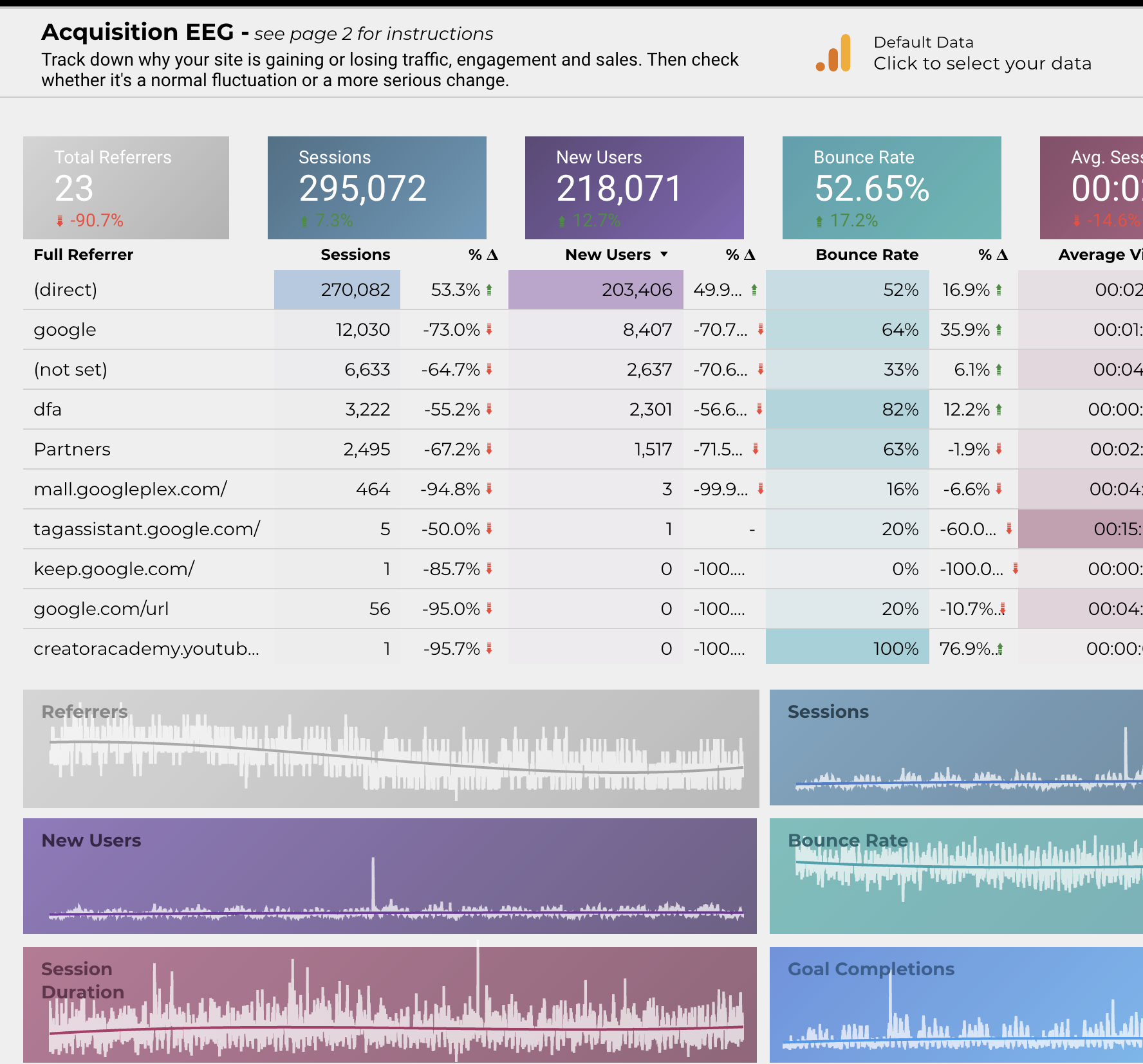
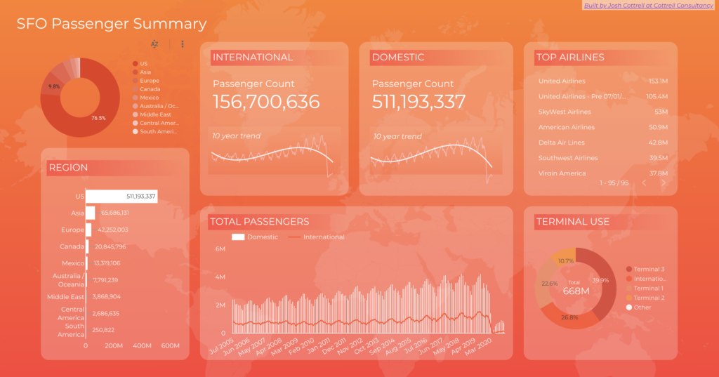
Notice how the bottom section of this dashboard keeps consistent colors for referrers, sessions, new users, etc. Your eye is able to quickly jump between the metric scorecards, the table and the trendlines at the bottom.
So how do you put it all together into a dashboard?
Here’s my approach using the example above.
I know it’s not this easy for everyone. If you’re struggling, find an existing example of a dashboard with colors you love and copy over the color scheme. The Data Studio template gallery has tons of great free options provided by Google. You can copy them over and then open up each shape/chart/text to examine what color is used.
That’s it for today! In part 5 we’ll be exploring shapes and the all the elements you can build simply using rectangles, circles and lines.
You can follow my Medium account to get notified when it’s released or connect with me on Twitter where I’ll post these and can answer questions.
Series links:
- Part 1: Hierarchy of data and leveraging narrative [published Apr 28, 2021]
- Part 2: Structuring and organizing your page [published May 6, 2021]
- Part 3: Choosing your page style [published May 7, 2021]
- Part 4: Sticking to a color palette [published May 13, 2021]
- Part 5: Understanding shapes and shape styles [publishing May 17, 2021]
- Part 6: Using PNGs and SVGs to do anything that can’t be done with shapes [coming soon]
- Part 7: Adding bells and whistles — remembering that complexity is a trade-off [coming soon]
Thanks for tuning in!
I hope this is valuable for you all. The Data Studio community is one of the most helpful and supportive groups you’ll find, so get engaged, ask questions, start conversations. We’re all here to help.
Josh Cottrell
DataStudioPro.com
Supermetrics Super Fan